
Designing & Building our own book!
- Overview
- Workshop – 24th March
- Initial Ideas – Research & Design
- Binding Dummy Testing
- Selection & InDesign
- Printing & Print Quality
- Tutorials & Logistics
- Building Time!
- Conclusion and Thoughts
Overview
The final part of the Everyday project was to create a Photobook. Something that would show off our work and introduce us to book binding & creation. That being said, I had no idea what I wanted my book to look like. I knew I wanted it to be conjunctive with the narrative, becoming a player of the game but had no idea where to begin.
After a week of research, designing and three long days of just building, I was so proud of what I had made. I know where the issues lay (I will be attempting it again on my own time as the clock is ticking) but for a first attempt at everything, I’m insanely proud of it.
Workshop – 24th March
Starting off, we were asked to send a PDF of around 25 images to Jon for printing. We’d got a visitor from a Publishing company coming in to help us learn how to sequence and design our books, as well as help us create a dummy. He showed us a range of different styles, aesthetics and binding techniques that helped start me off on how I want the final piece to look.
I’d sent in a random selection of photographs and started designing a simple, a5 saddle stitch book. Whereas I wasn’t happy with my pictures, it did give me an idea of the layout and what I wanted my narrative to be.
It also let me see how I would need to retouch my images ready for printing.
It also reminded me that I don’t do things by halves and always try to add a touch of “unique” to a project like this. The best example is the tryptic I’d attempted to create at the centre of the dummy, using a fold out page added on top.
Whereas I loved this idea of the tryptic, I wasn’t too happy with the idea of a simple A5, saddle stitched book that didn’t hold any characteristics of what I was showcasing.
Walking away from the workshop, I knew I wanted to carry on with the narrative of “An Evening at the Shop” however knew that this method of binding wasn’t right. Not only that, I now knew what needed to be done to my images, the most important being that they’re converted from RGB to CMYK & their exposure brought up. With colour being a huge part for some of these images, I couldn’t afford to lose these details.
Initial Ideas – Research & Design
As this type of subject hasn’t been covered by photographers in this manor, or at least as I could find, I was a bit stumped for where to begin with research.
I decided to visit some bookstores to see what I could find and use as a reference. Whereas places like Waterstones and Second-Hand Bookstores will only have publisher backed books, I needed to find somewhere that would let me find self-published projects. Amazon has recently introduced it’s publishing firm however, photobooks aren’t their forte. This was how I ended up on PhotoEye.com.
I scoured through page after page of these books. Whereas I wasn’t able to thumb through them, PhotoEye offers a “teaser” to them, letting you see a selection of images or, in some situations, the first “chapter”. It also had an archive of thousands of photobooks that allowed me to see many more. As well as a sub-category that was dedicated to self-published/self made books.
From the workshop previously, I had learned of a major issue with photobooks which was formatting. Creating a portrait book limits what you can offer with landscape images. The same goes in reverse. Chris (the workshop host) mentioned how you’ll often find Photobooks have a more square shape than rectangular, prioritising the images they want more.
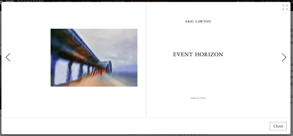
Event Horizon by Eric Lawton was one of the books I’d found which had the square shaped formatting. However, it did introduce me to something I didn’t like. The dead space. Whereas for some projects, it fits the theme. For me, I find it wasteful and boring.
Thanks to a few late night chats at the local, I knew of a few Photographers and Artists within Preston who had been published before. Taking a trip down, I ran into Tao Lashley-Burnley. An artist who has had a range of exhibitions and printed work. I also spoke with Jade Wier, a former UCLAN Photo student and Jonathon “Jonny” Yates, a local hobbyist photographer and Photography graduate.
I asked them a range of questions. From how they handle the blank space, cover ideas and even how they handle their narrative. Jade’s perspective as a former student gave me insight on what would be looked for at from an academic perspective whereas Tao and Jonny offered an artistic perspective.
Tao mentioned filling the dead space with graphics, sketches and/or non-photographic images that fit the narrative and can fill in the gaps. Jonny, a fellow nerd, mentioned using Magic The Gathering cards or other items that were thematic to the card game or store to help support it.
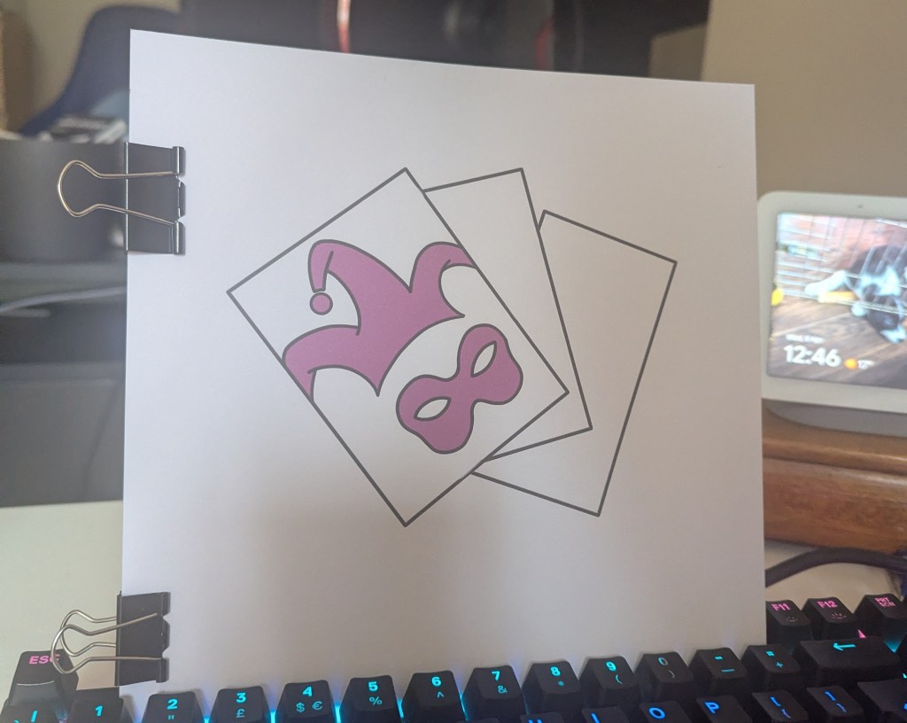
Heading home, I started messing with the idea of sketches and graphics. I wanted to design one for the cover, based off one of the book designs Chris showed us during the workshop. Taking a screen break, I grabbed some scrap paper and started messing about.
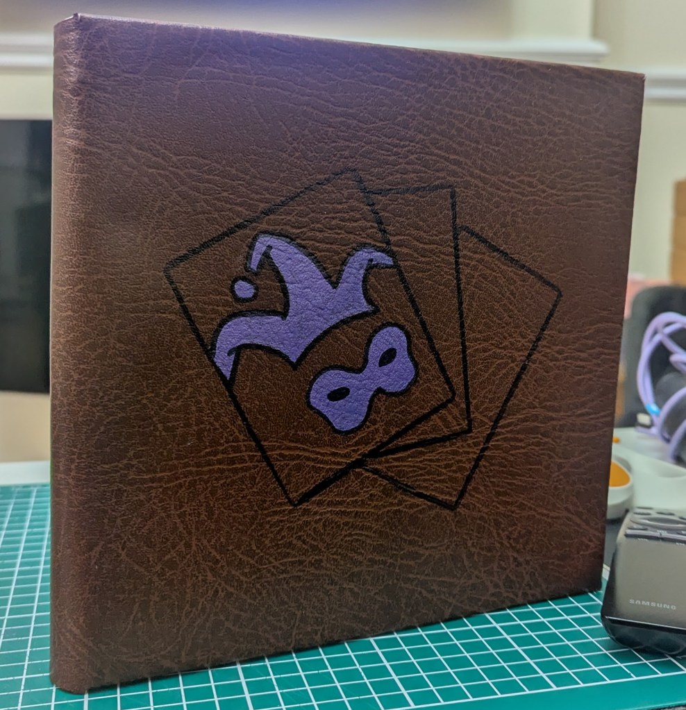
With this project being about Harlequins and MTG, I wanted to focus on this angle for a simple image.
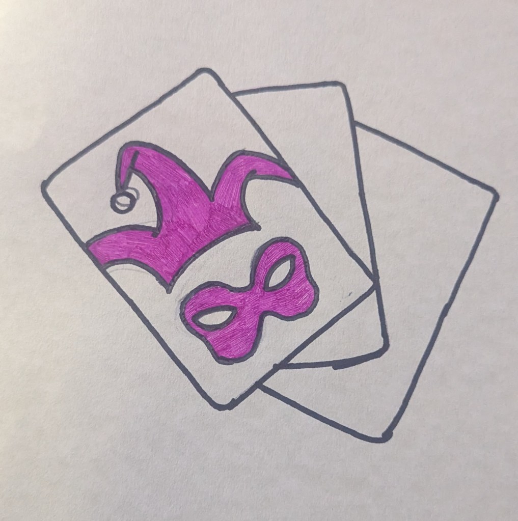
I used a Pokemon card to create a fanned card effect and the logo for Harlequins as the cards “back”.
I loved this design. It gave enough information without giving anything away. As an avid reader, the cover is a vital component as that’s what draws in your readers.
After a few hours and another trip to the bookstores, I was still lost on what I wanted my book to look like. That was until I spotted this on my fiancée’s desk:
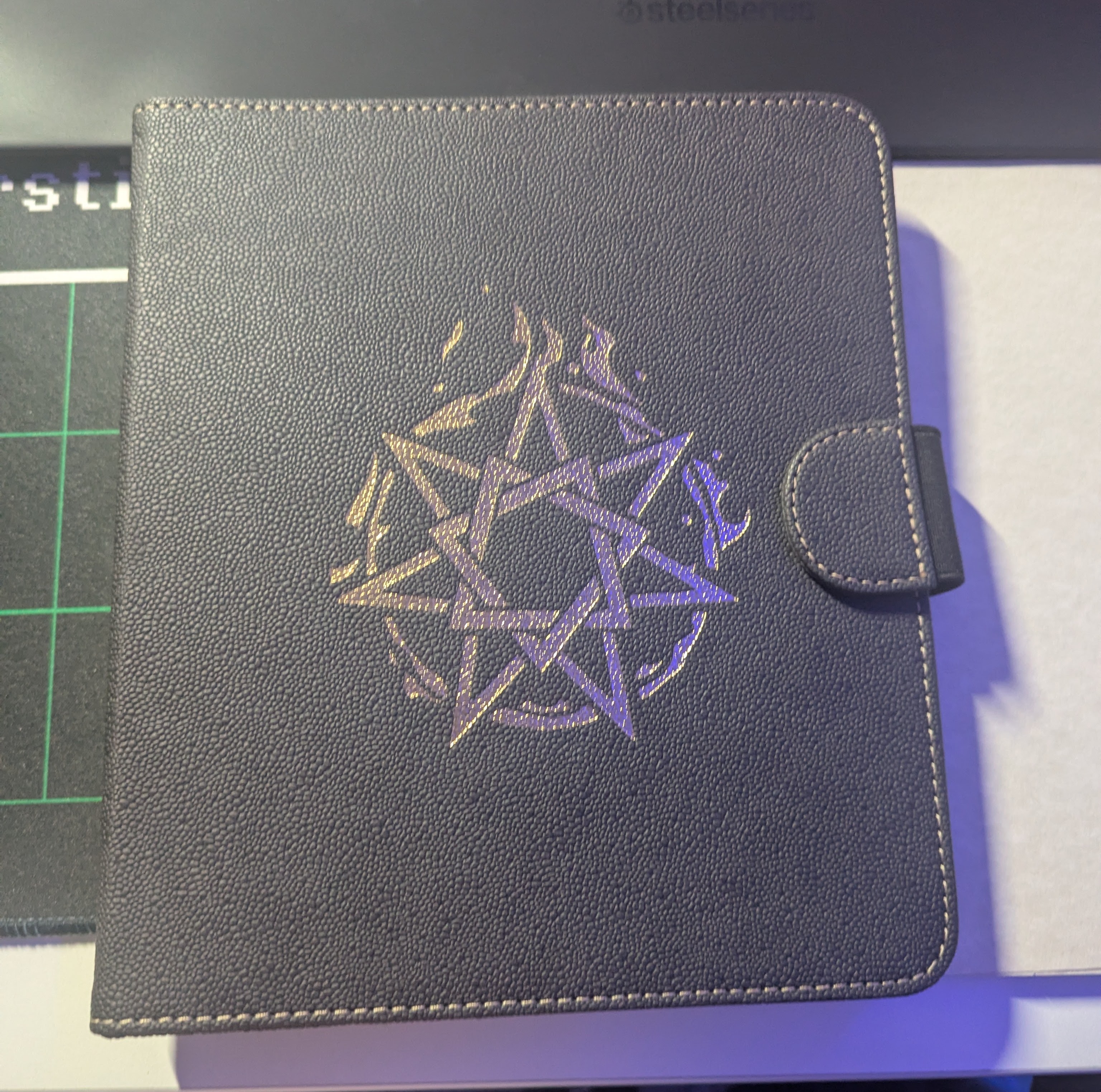
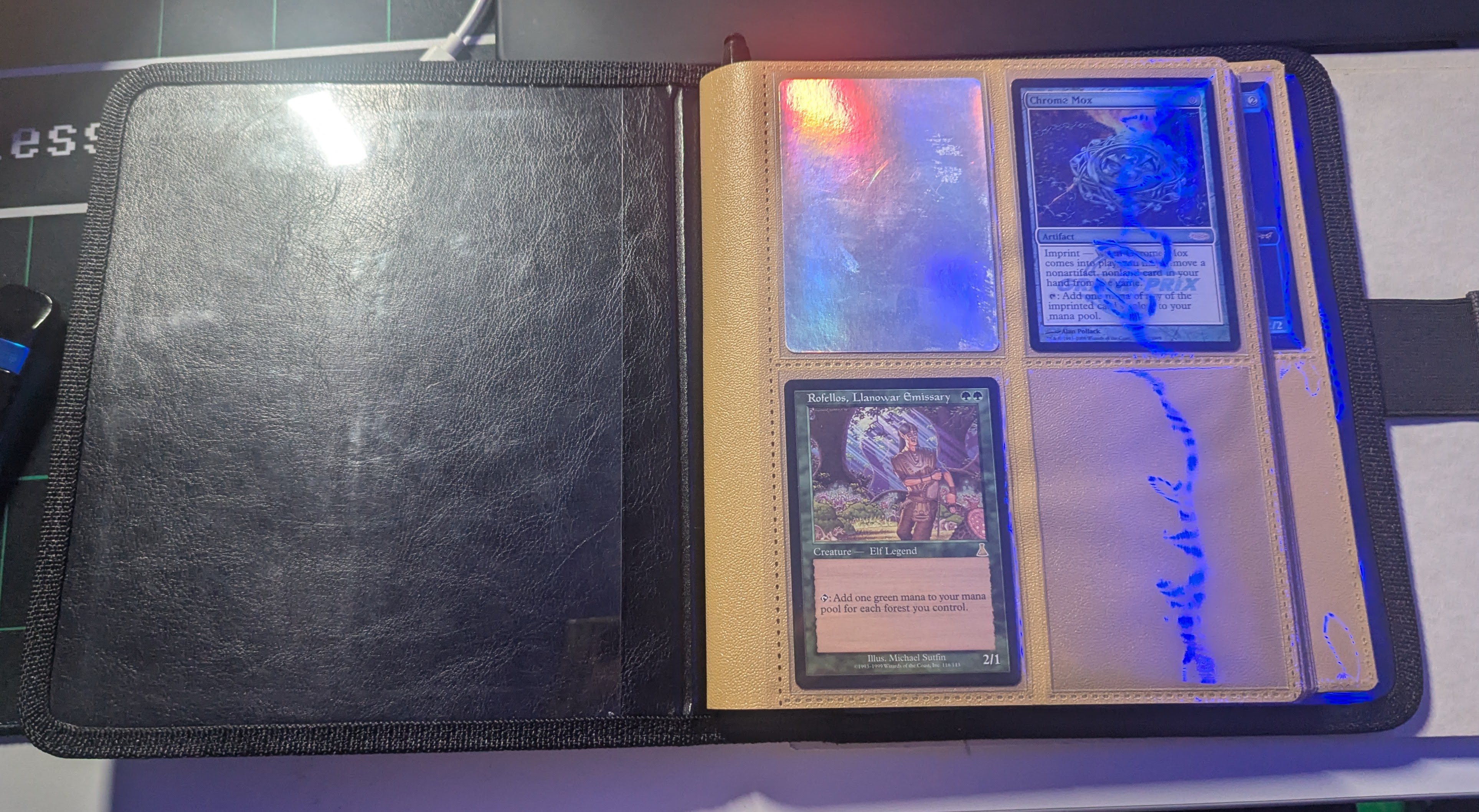
It’s a card binder for Dungeons and Dragons however, it’s been repurposed as a trade binder. Throughout the pages, there are gaps and spaces where cards are missing. From this, the idea started forming. Whereas not a perfect square, it creates a space for both Portrait and Landscape images, while also allowing thematic designs throughout the pages.
I first wanted to find out if this was logistically possible to create with my skillset and resources so started creating a dummy, to use as a base & reference later on.
Binding Dummy Testing
Using random bits from my sewing kit and some scrap card I had left, I started figuring out some logistics.
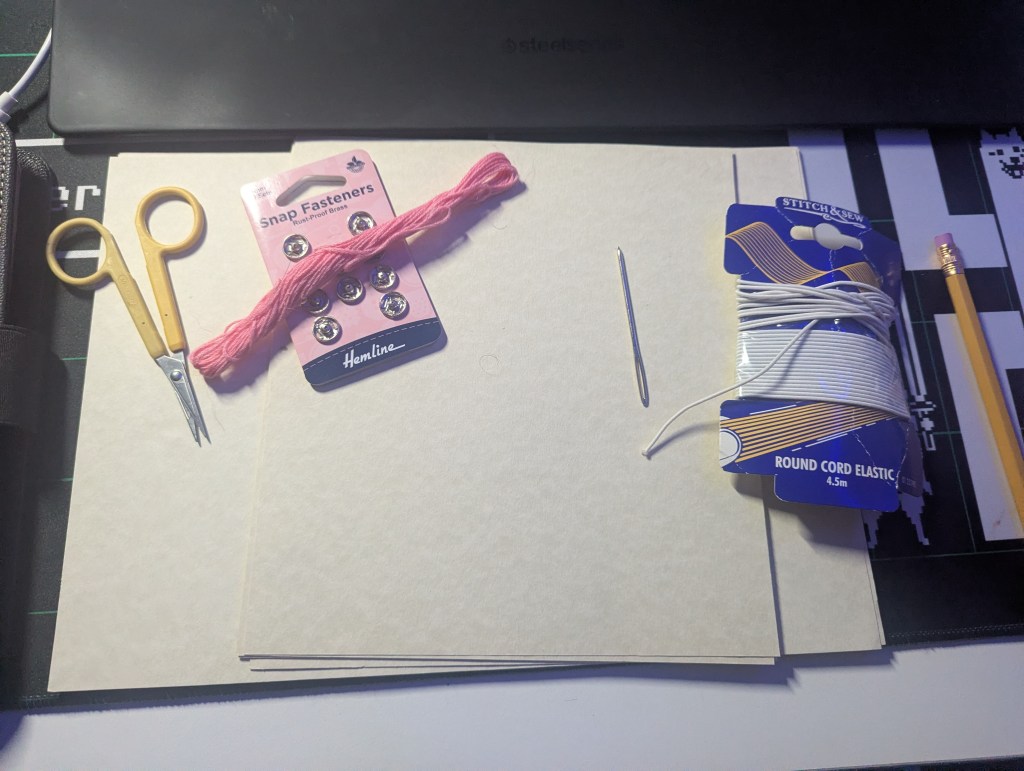
The binder isn’t a perfect square (21cm x 19cm) but this does mean it’s the same width as A4. Roughly cutting down the ends, I started thinking about the binding method that would be needed. It would need a single page bind, where I’d print double sided and bind each page separately. Theoretically I could create a “booklet” version, using a double page spread but I would need to print on A3 to create the same size. It’s something I’d like to attempt once I’d designed the book and start test-printing.
Now…To Youtube!
This video has been a lifesaver in this project. Whereas it would take considerably longer, it allowed each page to be bound independently and lay flat. Using embroidery thread, I started testing the idea out.
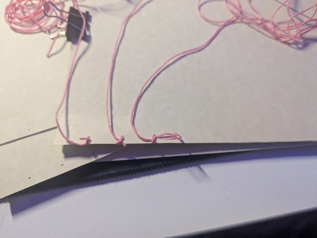
To say this is fiddly and tedious is an understatement. After an hour, I was less than 2 pages in and that’s including the cover. That being said, it did everything I needed it to do.
It was bound through 6 individual threads, each of which had to go through each page. No matter how I went about this, binding would take a long time. The saddle-stitch idea was becoming tempting however I wasn’t ready to throw this idea out yet.
Quick Chat
My family have dabbled into a lot of random skills over the years, from woodworking to leathercraft. After a call with my mum, I found out she’d previously hand bound books for my grandmother. Showing her the idea, reference and theme, she had the idea to leather wrap the cover & spine.
I had no idea how to do this.
To breakdown the conversation, we came up with the plan to get a cut of Leatherette, PVA glue and some mountboard. If we used the mountboard as a cover & bound it in, we could glue the leatherette onto it and have it wrap around the spine, creating the effect of a card binder.
For the cover, we could use gold/purple leaf to create the shimmering effect of the graphic. We had no idea if purple leaf was a real thing but worth a shop around.
In theory, this idea would work. Unfortunately, It would need to wait until payday which wouldn’t be until the week before deadline. In the meantime, I wanted to make sure I knew what I was doing so I could hit the ground running.
Using stitch markers instead of binding the dummy fully, I started seeing the book come together. I wanted to test out the idea of creating a clasp on the book, similar to the one on the original binder. Whereas that one was made using magnets, I wanted to see if there was any way I could create something akin to it.
Again, using random bits from my sewing kit, I used a piece of ribbon and a snap fastener to see if it would work. I sew it into the ribbon and used hot glue to hold down the side on the paper. As we’d be using leatherette, I can sew into it prior to gluing it down.
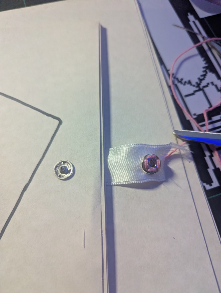
This idea did not work
The snap fasteners were too brutal and required a lot of pull to come loose. With the fold being made of ribbon, it tore straight through. Whatever I used to create the clasp would need to be of a stronger material.
After brainstorming a few ideas, I ended up coming up with the belt/belt loop idea. Sewing a small offcut onto the cover as a loop and then adding the flap (belt) into the cut off the back cover. Using felt, I created a test run:
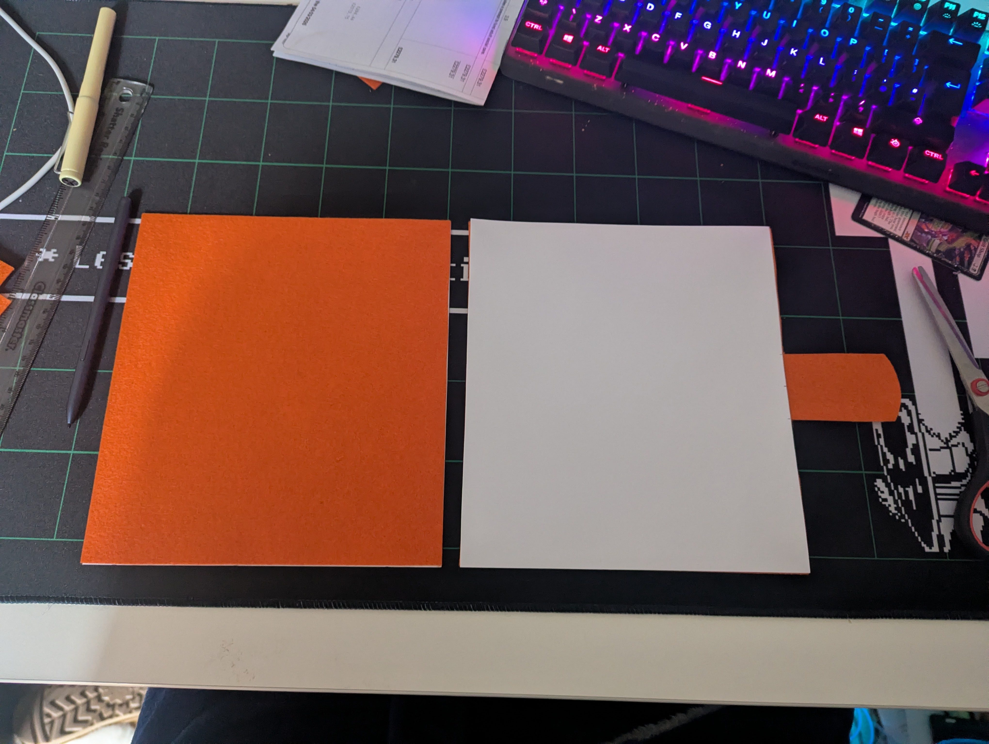
The corners would need to be wrapped over to prevent peeling and felt holds too much friction to be used as a material option. Bringing our choice back to solely leatherette for the cover. However, this clasp idea was now holding merit.
Dummy Takeaways
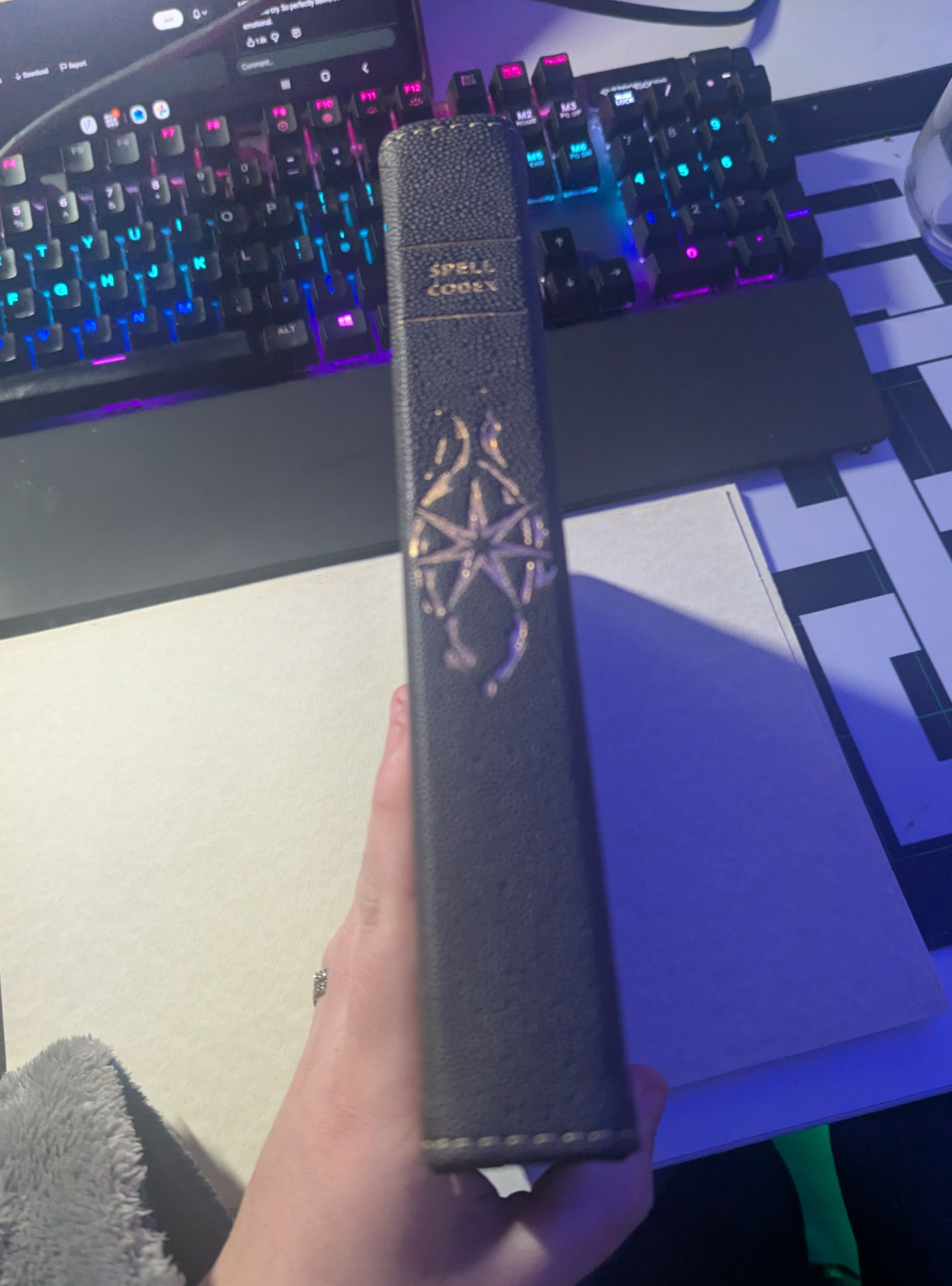
By the end of this, I knew what I wanted to do and the sizes I wanted to work with. Using the card binder as a reference, I wanted a leather bound book that replicated the effect of a card binder while telling a story. The cover would contain the graphic designed earlier using a gold leaf style effect.
I would have loved to create a press to emboss the graphic however, whereas I have the tools to do this, I don’t have the materials. I know the University offer this resource however as I wouldn’t have the materials until after payday, the studio space would be closed for Easter.
With all this in mind, as well as the range of feedback and information I’d gathered, I had a strong idea of what I wanted the book to look like.
Onto internals…
Selection & InDesign
I’d never used InDesign before and knew I had to figure it out quickly. Logic would dictate tutorials however I’m more of a “Push Buttons and hope for the best” kind of person. It was similar to software I’d used before meaning I could understand a bit of what was going on.
I was able to get measurements right from the beginning. As mentioned, the book was 19cm ![]() by 21cm (H) and using the power of Big Monitor I set it up that the size on my screen was as close to scale as possible. Meaning that whatever I was seeing digitally would match whatever was printed.
by 21cm (H) and using the power of Big Monitor I set it up that the size on my screen was as close to scale as possible. Meaning that whatever I was seeing digitally would match whatever was printed.
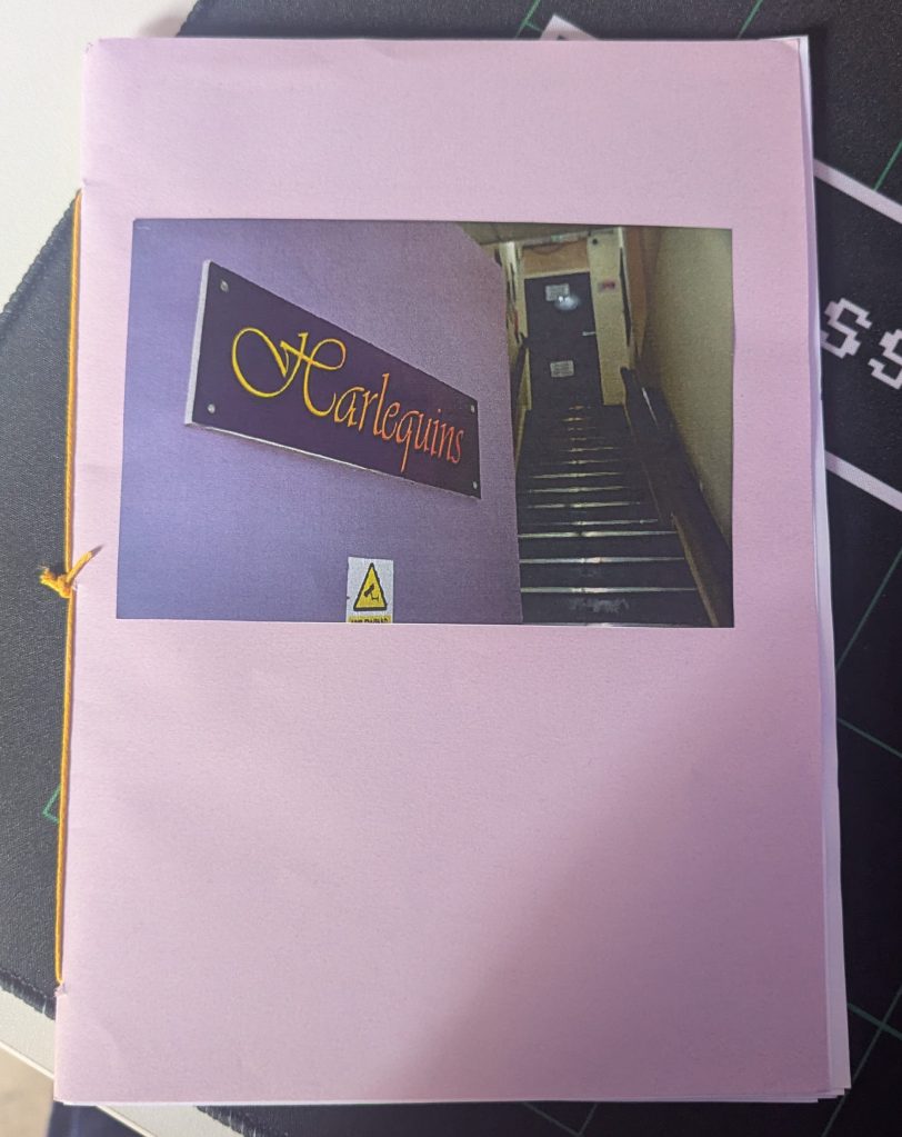
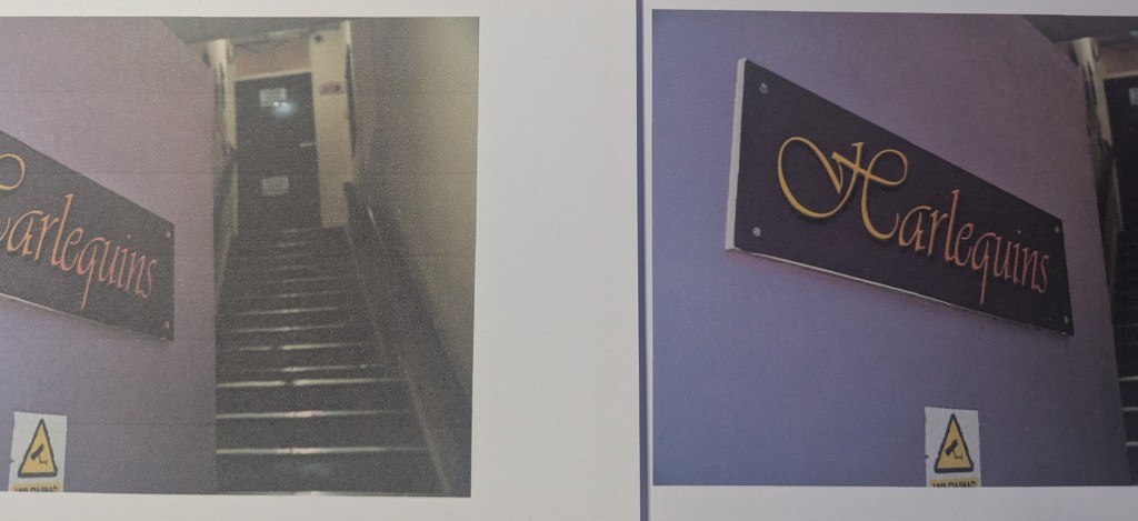
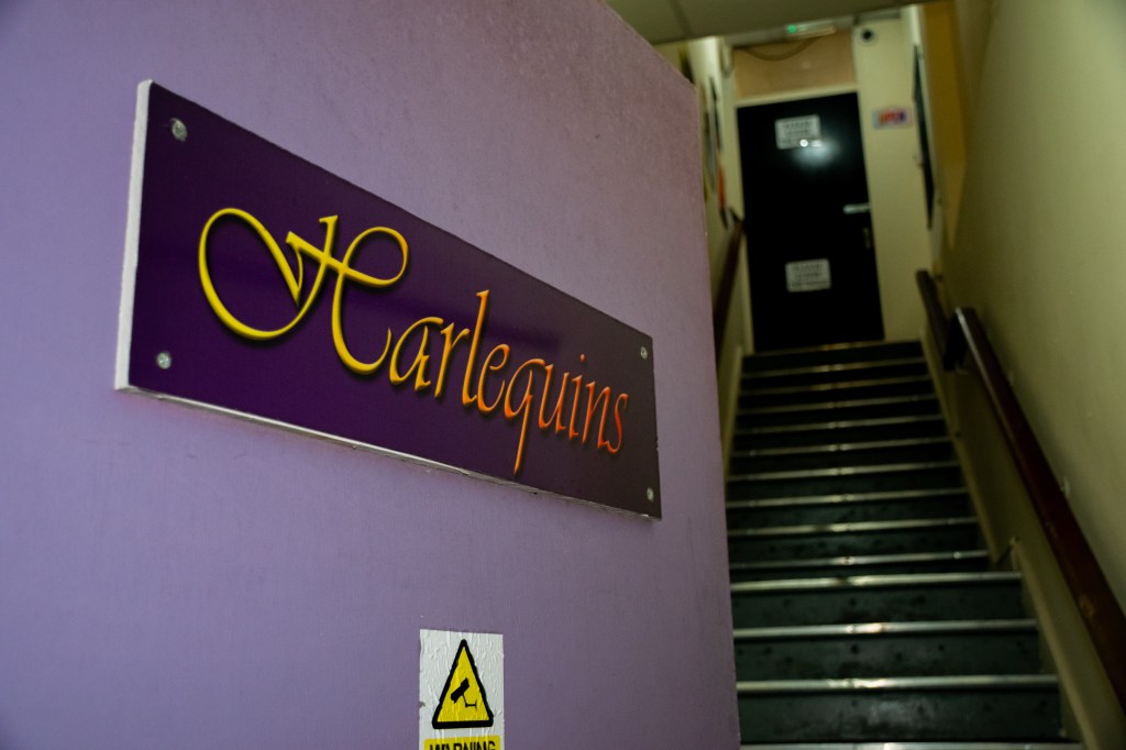
I knew how I wanted the book to start which gave me a way to mess around and figure some bits out. I knew I wanted the first page to be the graphic, followed by the Artistic Statement written for the submission and the image of Harlequins front door. It created a strong sense of opening and starting this journey. Once I’d got this implemented, it was time to start selecting what images I wanted.
To help with this, I did two things. The first was to break it down into chapters. I did this with the last project to help with the narrative and it worked a charm. There were different stages I wanted to cover:
- Arrival & Shopping
- Game set up & friends
- Gameplay
- Game over / Victory
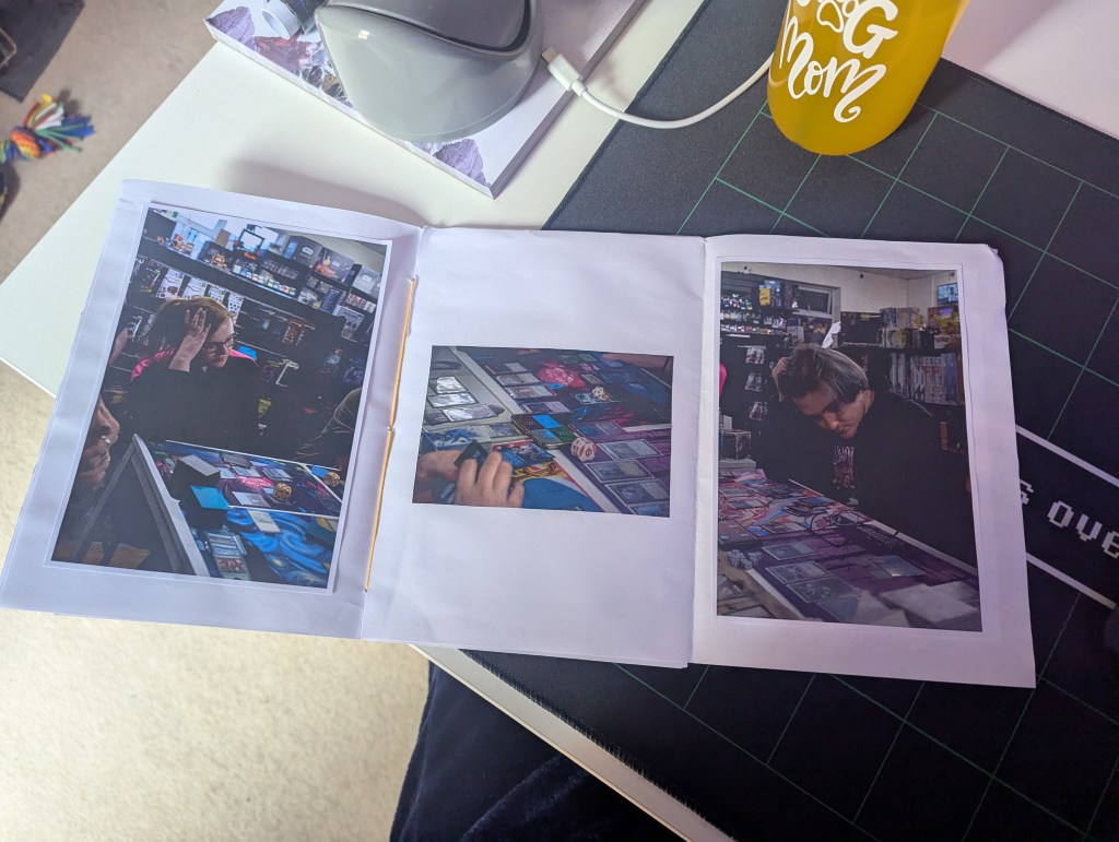
With this, it would help me separate the images. Speaking of, this was where it got rough. After the editing stage previously, I was left with just over 200 images. I had separated some off before but after the workshop, I wasn’t happy with the selection. I decided to tactically restart and go again.
Instead of looking at the edited images, I went back to the raw versions and started selecting ones that I visually preferred, not ones that would fit the narrative. Yes, this still left me with 100-ish images however, I could start whittling down physically.
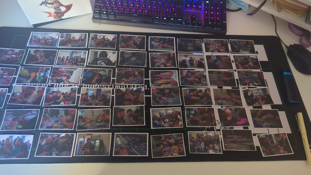
Exporting into a wallet sized format, I printed all 100+ images and laid them out across my desk, split into landscape and portrait. Using the above mentioned chapters, I separated them out again.
From this, I started trying to build a story. That being said, I was worried about how to structure it. After a few hours of messing around and a million different ways, I went back through a conversation I had with Tao a few days prior.
He’d mentioned styling the pages to be thematic, including the extras mentioned before. This was where the idea of sizing the photographs to be the same size as a card in the binder. Using the shape tool and a ruler, I created a guide that replicated a page within the binder. Each section matched the average measurement of a TCG Card, meaning that it created as close of a replication as possible. I also created a page using the same sizing to include landscape images.
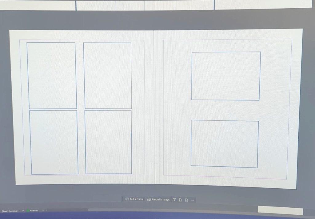
The landscape idea wasn’t sitting right however I loved the idea of the 2×2 grid for the portrait. With this, I started building a few pages focusing on the portrait.
This was where the addition of the cards came in. While I was working on the grid, Ed brought over a card I’d been asking about, “Gift Shop” from the Unfinity Set. A personal favourite however it did give me an idea. Using cards from the game to fill some of the blank spaces and carry on with the narrative.
There are over 30,000 different cards in Magic The Gathering, surely there are some that would have names that fit. After a few trips to reddit, I found a database website called Scryfall which allows you to download hi-res scans of the card and all their different prints. Meaning that I was no longer limited to my own collection, I had the full database to my disposable.
Starting from the beginning, I started finding ones that could help with the narrative. We had “Gift Shop” for the shopping aspect, I started looking for a “Friends Gathering” style one. Through Scryfall, I started typing in keywords and seeing what came up.
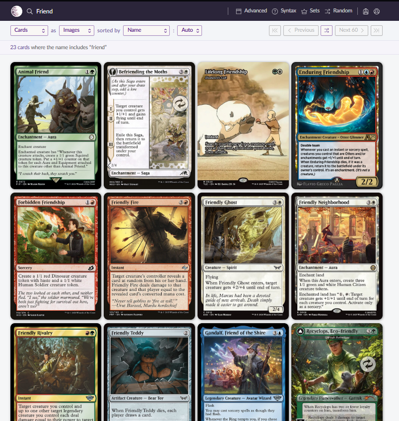
After a bit of hunting and searching, I’d found a few different ones that could be used, as well as a few funny ones that were possibilities. This then let the design train start rolling.
Implementing landscape images was a small issue however it was doom scrolling on Instagram that gave me the final idea. Pokémon card Collectors often create two card sleeve spreads to add depth and creativeness to their binders. It’s called the “Michi Method”. This gave me the idea to spread the landscape images over two “card slots” instead of rearranging the whole spread. This only changed when I wanted an image to be the sole focus on the page where I cropped them down to fit all the squares.
Once again, the design train got rolling. It seemed that with the above mentioned additions, the book started creating itself. There was only choice left to make.
Grid or no Grid
I did two test prints for both the printers sake & to make sure the retouching was doing okay. On the first print, I hadn’t included them but as I’d become to used to seeing the guidelines on the digital copy, the page felt way too empty. As a “eh, let’s see”, I printed a version with the lines. It seem to complete the page.
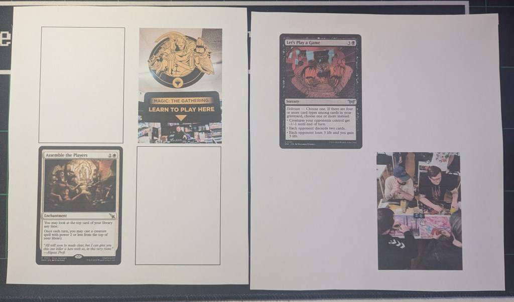
The addition of the blank squares helps build the idea of a card binder, not just empty spaces.
In regards to InDesign, I started doing a lot better and it got a lot smoother. The next round of issues didn’t arrive until we hit the printing stage. Speaking of, moving on!
Printing & Print Quality
Alongside this project, I’d been experimenting with what GSM my printer could handle. My original plan was to get this printed through the University Print Shop however, due to the delay caused by payday, I wasn’t able to get it in with enough time to spare. Rymans was an option with an instant turnaround however, the price tag wasn’t pretty.
I found that my personal printer could handle up to 240gsm as long as it was soft card. If solid, only 180gsm. I also had been messing with the print settings themselves. Standard printers, when printing images, end up with grain and print lines due to it prioritising speed over detail. If you increase the quality & slow down the print speed, you can get richer colours and remove the grain and print lines.
I had a few different types of paper available for printing, from coloured to acrylic with a wide range of gsm and textures. By the end of it, I was left with two viable options:
- 240gsm White Card Stock
- 200gsm Acrylic Paper
The acrylic had a canvas textured effect that would work for an artistic theme however, given the choices made earlier on regarding thematic design, the cardstock worked better.
TCG cards are printed on around 300-350gsm. I did attempt to print on this level of GSM however, my printer did not like trying to feed it through. 240gsm was the most my printer could handle. There was discussion regarding laminating the pages to create a more “TCG Card” effect however the needed laminating sheets wouldn’t have arrived in time. In hindsight, I do wish I’d laminated them to give the paper more strength during the binding stage.
Once I’d found the right paper, it was time to figure out the best way to print. Unfortunately, my printer doesn’t offer an automatic double sided printing option. Meaning I would need to reload each page separately before printing again. After messing around with a few settings, I found that Adobe Acrobat allowed a manual printing option which halted printing, allowing you time to reload the paper and print accurately double sided.
With this, I attempted a booklet printing. This did not work on both attempts
Attempt One:
Due to the way I’d exported it, the pages printed as double page spreads, not individual pages. This means that on the left was pages 1 & 24, right was pages 2 & 23. I cancelled this print after page one.
Attempt Two:
This time I had re-exported the pages as individual pages, however the manual reloading failed and wasn’t successful. During this, we also learned that the automatic feature Adobe offers on Acrobat for Booklet printing wasn’t organising the pages correctly. It started correct however after around page 4, it started throwing it out of order. Not only that, I wasn’t able to rotate the pages the right way around meaning we had pages upside down.
Overall, I was starting to lose my patience with Adobe and elected to scrap the booklet idea and go back to the single page binding. This meant a longer time frame however prevented wasting more paper and ink. During this stage, I’d also been figuring out the print settings that would give me the crop marks for the correct size. It allowed me to align both sides, making sure nothing was misaligned.
All in, it took around 4 hours of printing, mainly due to the longer print time for better quality, but I ended up with all 14 pages accounted for, front and back. Using the paper guillotine, I cropped each page down, leaving the sides at their full 21cm length, allowing for trimming down should it be needed.
Tutorials & Logistics
Heading back to Youtube, I started trying to find the correct tutorials for what I was after. I knew what binding method I wanted however, creating the cover & leatherette wrap was becoming an issue. I had no idea where to start.
That being said, I knew of a creator who specialised in major rebinding projects and had recently created an oversized copy (A2) of one of Brandon Sandersons series. With it being in A2, I could see the steps clearly on a much larger scale. That being said, it did require slowing down the montage sections and working with an idea less than a tutorial of sorts.
Using the video, I was able to figure out the theory around how to bind this. I would need to create a pattern using the covers & spine and add an excess, allowing me to wrap the edges. This can then be covered after with a sheet of felt or adjacent material. The issue came with how I was going to imprint the decal on the front. Martina uses a press to emboss and then stains it. Whereas I have the means to make this, this requires too much in the eyes of materials. After a trip to four different craft stores, we also discovered that purple coloured gold leaf is very hard to come by. This left us back at square one for the cover.
After a deep dive into DIY Forums in the middle of Hobbycraft, I found that oil based markers (Sharpies) and water based Paint Pens adhere to leatherette very well, with little damage when buffed. I picked up a selection of metallic paint pens that offered the shade of purple I wanted, as well as some Fine Liner Sharpies. I would need to test these on a scrap cut once I’ve gotten to that stage of building. Purchasing the Leatherette wasn’t the cheapest thing in the world (£13 per metre) meaning I couldn’t afford any to go to waste.
As I didn’t have a set pattern either, I couldn’t afford to make a dummy attempt for the cover. The only thing I knew for certain was that I would need to bind the leather to a solid piece of board to create a secure cover. After going through our collection of random pieces, I had a selection of Mount Board available that was secure enough to hold the leatherette but would have enough versatility to act as a cover.
That being said, everything was now lined up and it was time to start building this thing.
NEXT PAGE – BUILDING & FINAL RESULT

Leave a comment