Is this the week I can make a Red vs Blue references?
TLDR;
Two images, One Story or conversation. My own creations too!
- Lecture Notes & Takeaway
- Main Goal
- Lost & Found – Joachim Schmid
- Reference – Doki Doki Literature Club
- Diptychs: A Detour
- Building the Final Two Diptychs.
- Final Thoughts
Tuesday arrives and its absolutely freezing. No Monster this week but a Costa Coffee keeping me warm.
Lecture Notes & Takeaway
Once again, I ask why lecturers are so vague. What do you mean “Unlikely Alliance”? All I’m picturing is a dog and cat coming together and saving the world. I really do live in a fantasy world.
Dans’ Wise Words of the Week: Photography can be thought of as a language, we can read images, they can tell us something. Can two images talk to each other?
He then takes us through a few different examples of what he’s trying to say. We look at typography, diptychs & triptychs and even where text intersects with images.
–Slideshow (3)–
This is starting to make sense now. It’s basically a two slot photo frame, telling one story. Dan started comparing it to a two-page spread across a magazine or a picture frame. Thinking about sequencing, layout and the bigger story you’re trying to tell. It’s a weird concept but one that’s quite interesting.
Main Goal
Our mission:
Research on the theme of unlikely alliances. This could be diptychs, triptychs sequences of images, typologies, and/or image and text.
Take a series of images that you can use to create unlikely alliances. Then create some diptychs from a selection of your images.
Whereas I’m still picturing a lion and a mouse, I understand the task at hand. Two images or subjects that shouldn’t work but do. I think I can work with this one and create something weird and wonderful.
Unlike previous weeks, I’m going to condense everything into one post but two pages. Page two will be production and final products.
Lost & Found – Joachim Schmid
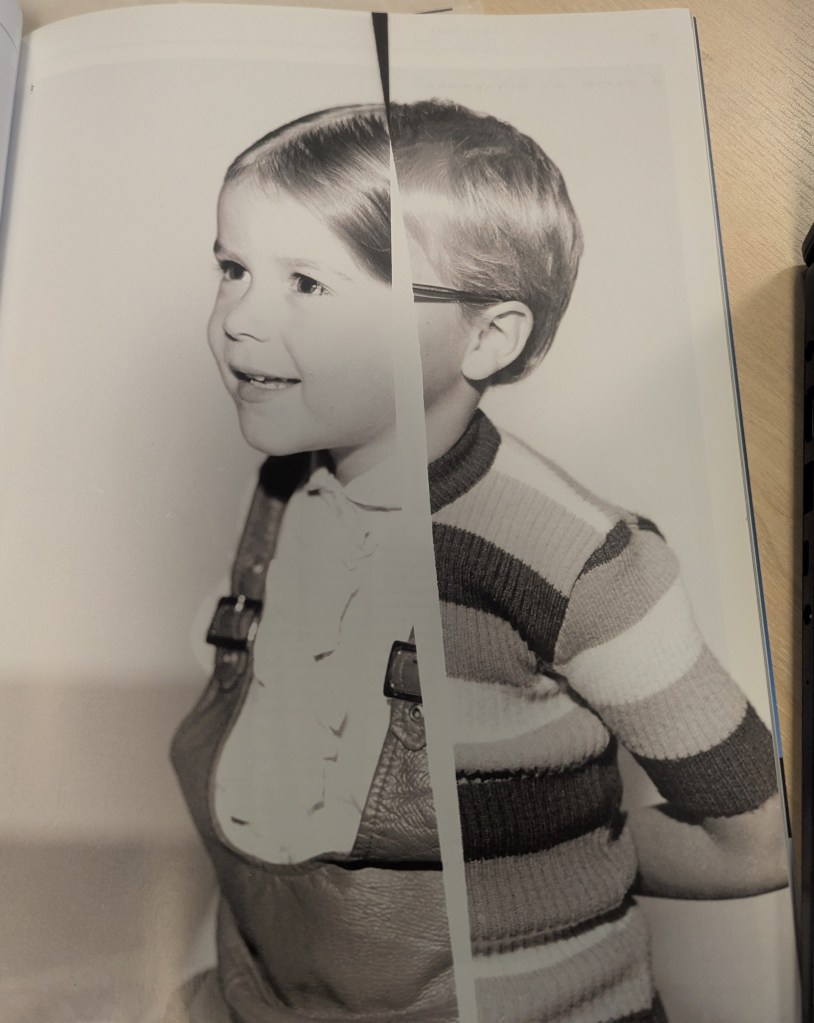
While listening to the Wise Teachings of Dan, I became distracted by a copy of the British Journal of Photography. Specifically because of it’s cover:
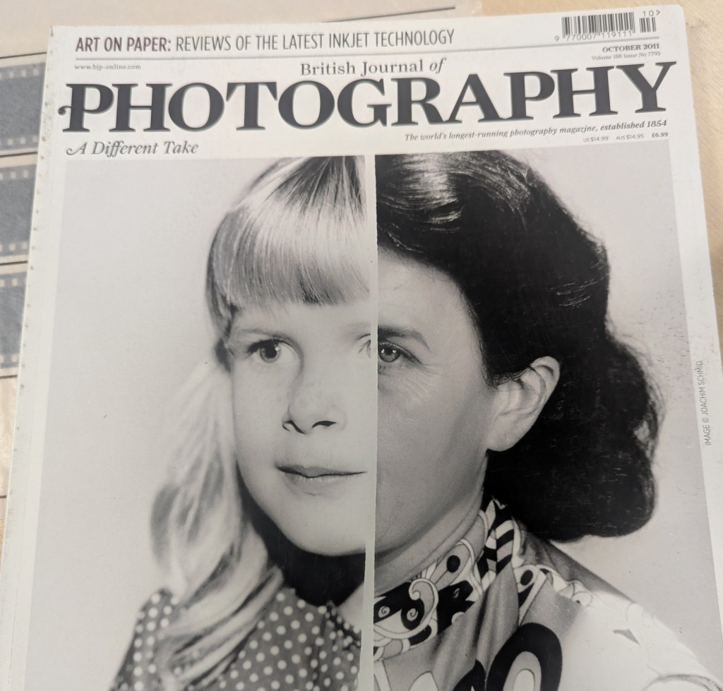
Reading through the article, it mentions how Schmid has buried himself in archives and flea markets, using images he’s found to create these art works. Later on he speaks about the big lies hidden in the photographs his father took and the history he’s trying to tell. But this Frankenstein depiction is fantastic to view. You assume you’re looking at Mother and Daughter when in actuality you’ve got no idea.
Later on, they show other pieces of his. I mostly prefer his images of the faces, splitting them in two. Reminds me of when you see the images of mothers & children.

I have no idea if I’m even barking up the right tree here but either way, this is such a brilliant concept and I may dabble with this a bit.
Playing around
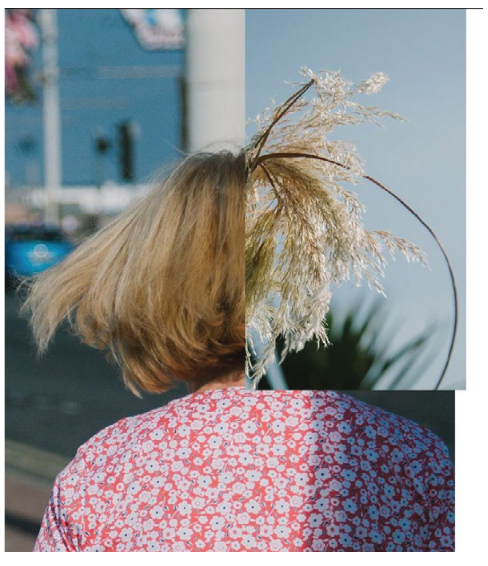
Seeing this idea, I wanted to play around with a few images I had saved. The idea of “Old and New” or “Past and Present” kept floating around my head. As is probably expected at this point, I started with images of Koda.
We’ve had him since 8 weeks old, meaning his whole life is documented through images and videos. I found one from him at around 16 weeks old and matched it with one from about 6 months ago (He was 18 months old-ish)
Instead of spending three hours with photoshop, I ended up just cropping the images in the Windows Photo Editor and laying the two tabs over each other. Work Smarter, Not Harder 🙂
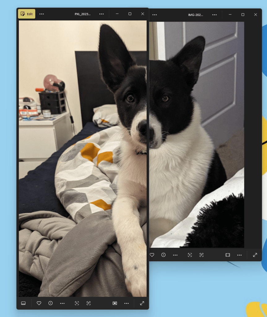
I liked the idea but I feel that Koda isn’t the right subject for this. I went back through old photos and found some from when Ed and I starting dating. Most of them are photos of us together, meaning no Ed on his own but I was working with what I had.
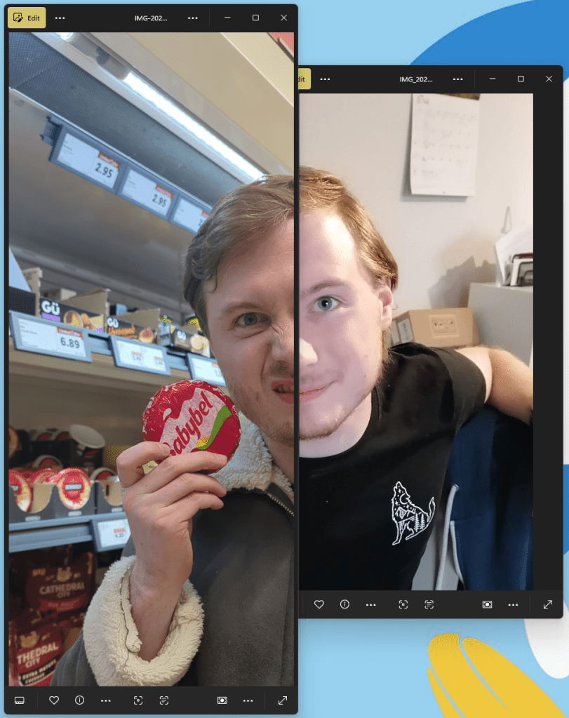
To say that Ed was not amused with this one is an understatement. I was specifically told to burn it and never create this abomination again. So I’m plastering it across the internet for the world to see.
I’m leaving this idea here for now as it’s requiring me to focus on old images and put my faith in what I’ve previously taken, not what I can take now. This may be something I drop back to later on.
Reference – Doki Doki Literature Club
Bare with me here, it’ll make sense in a moment.
Within the games merchandise, Team Salvato released a line of posters. Individually, they looked fantastic, showing each character, their role and aspect in the game.
When connected, you can notice the Red String of Fate connecting them all together.
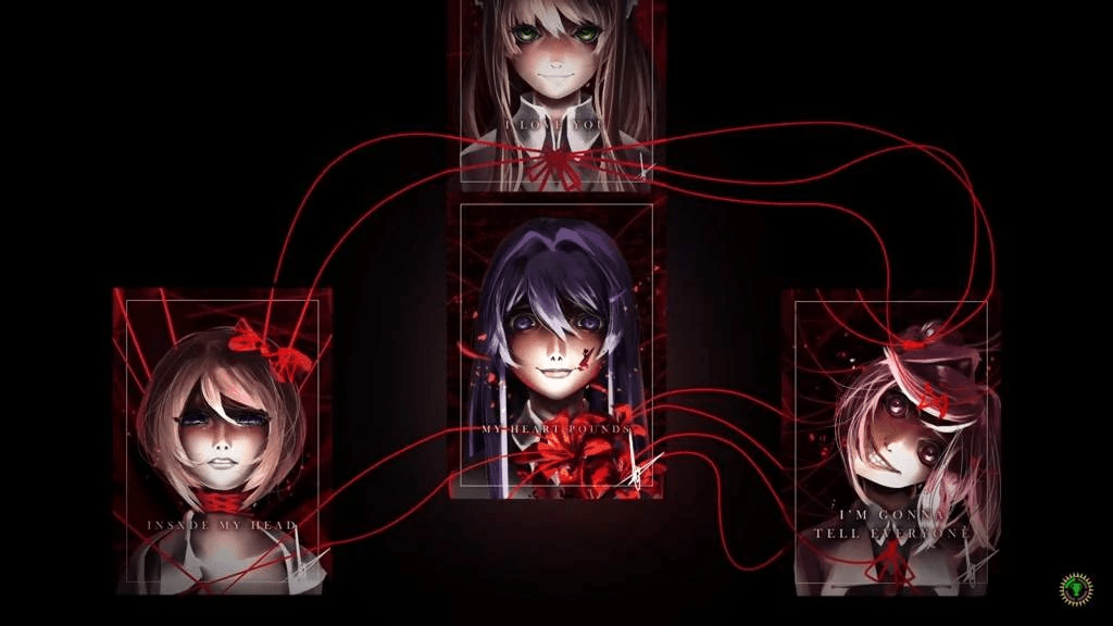
Whereas not photography, it’s still something to note going forward. It can be a detail as small as a red string connecting the images and not even directly.
Sketching it down, I started playing around with this idea. One single piece of “string” going across each image connecting them. The images themselves don’t need to correlate directly.
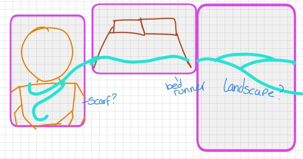
One connecting thread, although not literally a thread, could be something to look into. It would take a fair bit of work and a lot of planning and specific placements.
My main issue with this specific draft is that the images cannot sit flat next to each other. Obviously this was thrown together in 30 seconds out of random things I can see around me but, maybe with more planning, this is something I can work with.
Idea – Siblings? Ed’s the eldest of three and we’re seeing them both a New Years. Is that cutting it too close?
Instead of siblings, we could do family. Gives me a reason to make a family project that means I’m in shot. Can’t get Koda in the studio. Damn it.
Idea Development
While sketching out an idea for a two panel image that connects in the middle, I quickly grabbed my camera and took two images, one of my bed, the other of my desk I’m not apologising for the snacks.
Taking the idea of one connecting line, bringing together two images, I ended up with this:
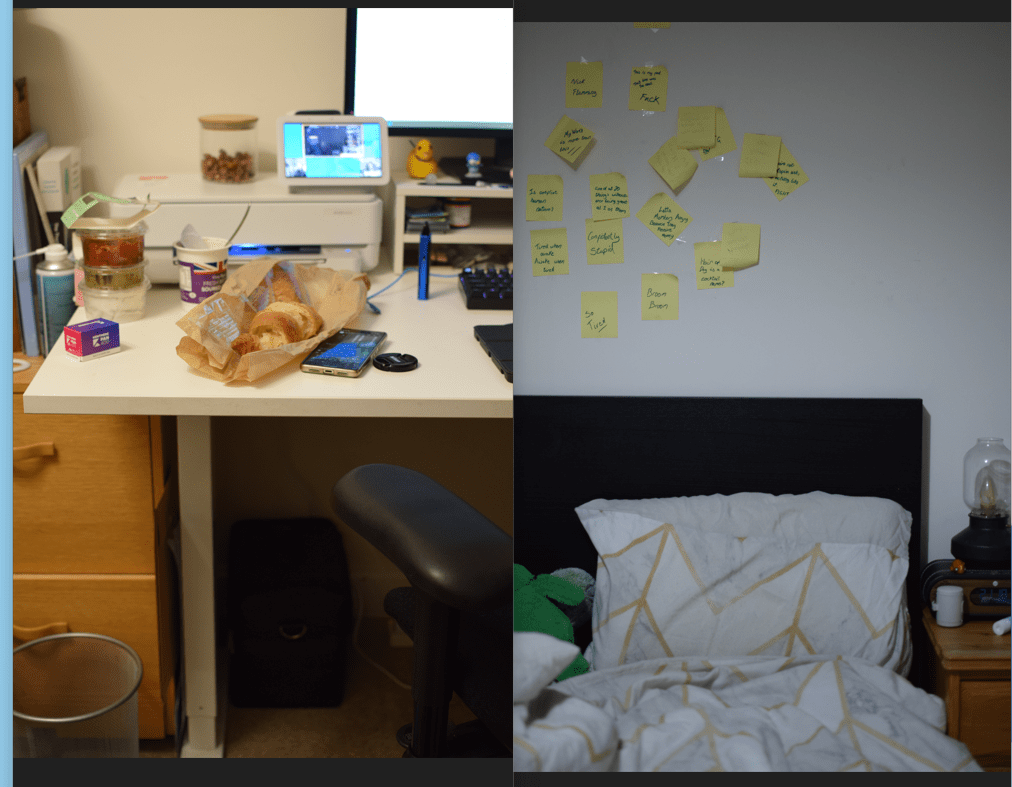
I love this juxtaposition. Messy bed, messy desk. A fantastic accident. With some planning and tidying set-prep this could become quite powerful.
This then sent me down a rabbit hole of what two things can I combine together and end up with one image. I wasn’t aiming for anything fancy at this stage, just a rough sketch essentially. I probably spent more time lining the tabs up than actually taking the image.
I started off with books. I read both physically and digitally. What would that look like as one?
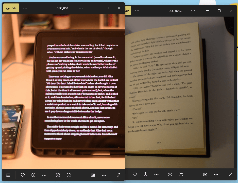
The contract between the “Dark Mode” of the tablet and the white paper was something that caught me off guard. That and the shapes within the image. This idea is definitely one I want to work on more
From this, I looked at shapes/geometry more, what two things are similar shapes but vastly different?
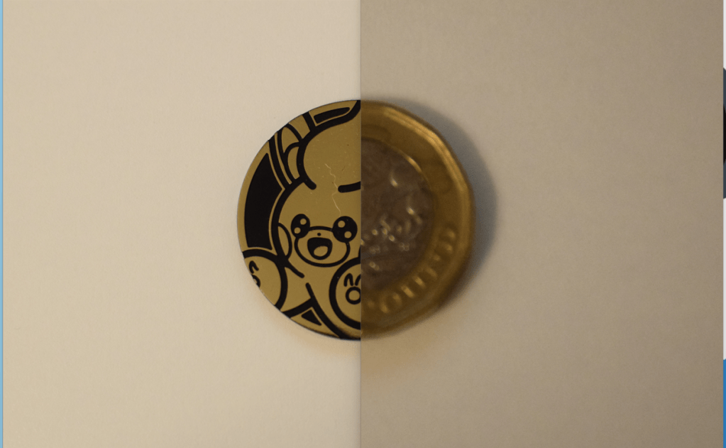
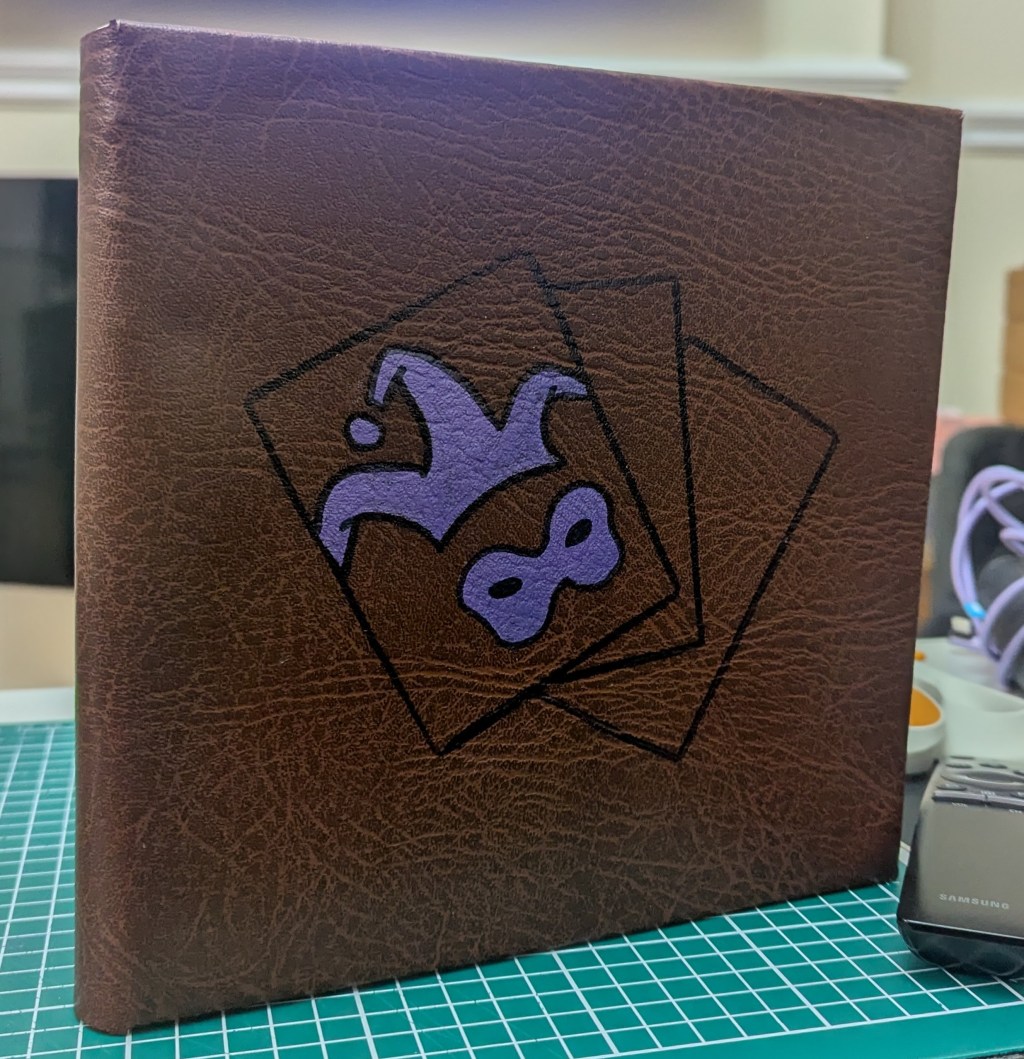
The coin works wonderfully and has a weird hidden message within it. It takes a second to realise but it’s one hell of a statement on Addictions. Trading cards are considered gambling at this point, with recent scandals regarding “Loot Boxes” and with that, it falls under addiction. The counter is from Pokémon Blister Packs and is used as an in-game coin, instead of actual coins.
This sent me off somewhere, trying to create something that shows this message but better.
I found a packet of “Cold & Flu” tablets and noticed this blister pack is the same size as a standard Trading Card. Using a Magic the Gathering one as a place holder, I ended up with this:
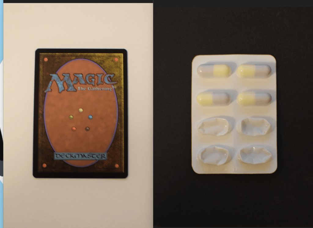
I love this idea, the black & white backgrounds contrasting against the objects.
This one I want to create properly and with care.
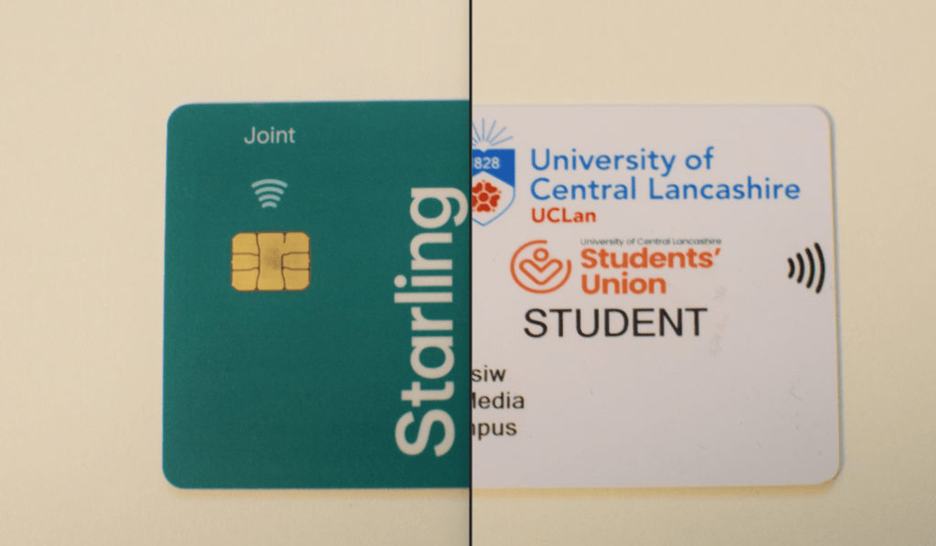
Moving on a bit, I had also found that my Bank Card & Student ID are the same size as well. Playing around with this idea, and the concept of Student Loans was fun but I risk revealing personal information on either object. With that in mind, I left this idea behind.
Wrapping up this little Idea stage, I’m happy with the result. The idea of Trading Cards being an addiction is definitely an aspect I’d like to cover and I want to play around with the composition of it.
I’d also like to reattempt the book idea, playing technology against analogue, Light mode against dark. As someone who uses both, I wonder what is possible with this?
Attempt Two
Trying to recreate some of these images for the final piece, I came across a fair few problems that, ultimately left me with a limited few.
Safe Places:
My desk is on the right hand side. My bedside is also on the right. Unfortunately, two rights don’t make a left. This meant I either needed to rearrange my desk slightly or use Ed’s side of the bed. I ended up just moving my desk around.
Creating that sharp line through the middle was the key item in this image, meaning I had to shimmy everything around to achieve this.
Trading // Addiction
Working at such close detail, you see so many more imperfections. Initially, I attempted to use a Pokémon Card, one that’s more personal but the colours were too aggressive against the monochrome backgrounds. That being said, the browns of the Magic the Gathering cards mixed beautifully with the whole image.
Once I’d taken them, the issue then was any minor detail, a bit of fluff or a dent was picked up by the camera. This is one of the rare occasions I actually healed some images but it was needed. I did also tweak the lighting on the tablets image, mainly to show the sharp lines and remove the bouncing light.
Digital // Analogue
This idea couldn’t hit the ground. I loved it, I had a really fantastic plan but one major issue kept me from hitting the mark.
Trying to photograph a digital screen is a Nightmare. Especially when you’re trying to capture dark mode.
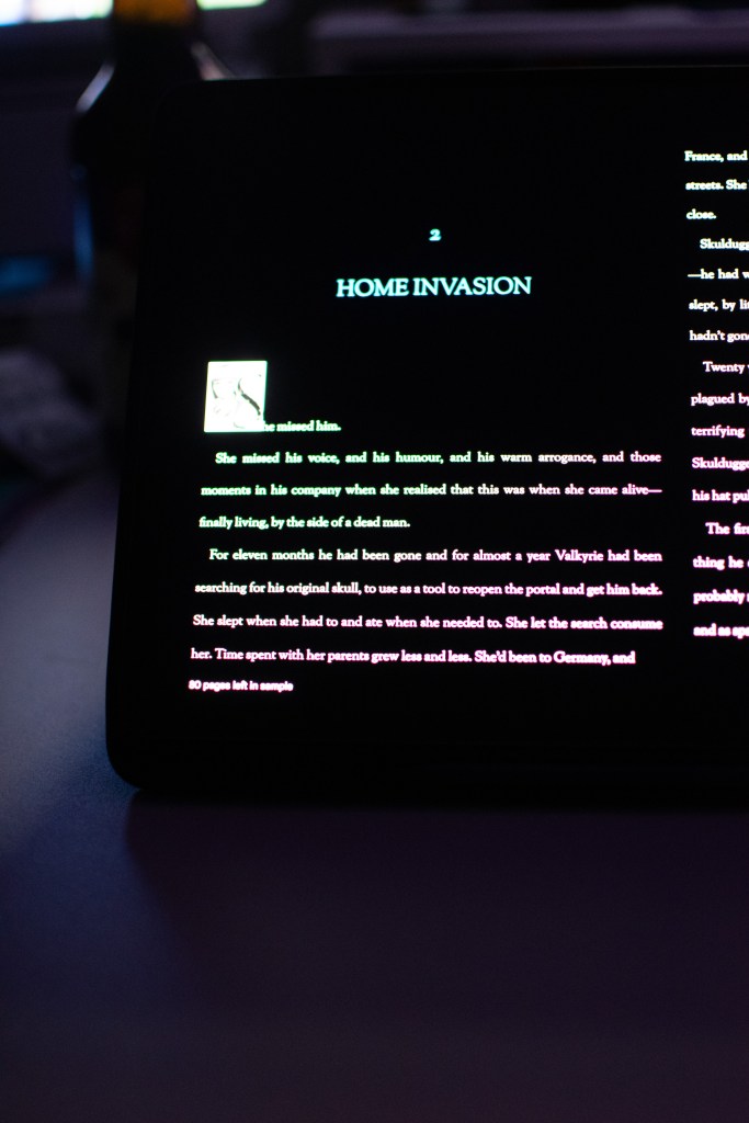
The white text became too blinding when in dark but became illegible when in light. It was a catch 22. I thought I’d made it with this image but the drop cap is completely gone, you can’t make it out.
The idea seemed so simple
One image shows the book on the tablet, dark mode. The other shows the book in it’s original setting. If possible, use the same story & match up the pages.
It really wasn’t though. No matter how I tried to change my settings, the lighting or even just the situation, I kept ending up with this same issue. With that, I ended up benching this idea, especially after the progress with the other two.
It seems this idea was not destined to be.
Library – A Weird Find
Hiding away from the cold, I went on a mooch around the library. I ended up sat on the floor, in the Photography section, pulling books out at random and seeing what I could find. I ended up going through a copy of “British Photography: Towards a Bigger Picture” and found a range of photographers and collections that I thought were fantastic!
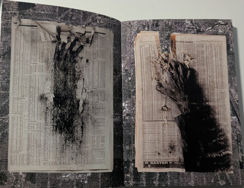
Family Album – David A Bailey (1987)
I love this sequencing, a slight difference between each image but an overarching theme. It’s the small detail of the time changing with the newspapers.
Robert Smithson – Incidents of Mirror (1969)
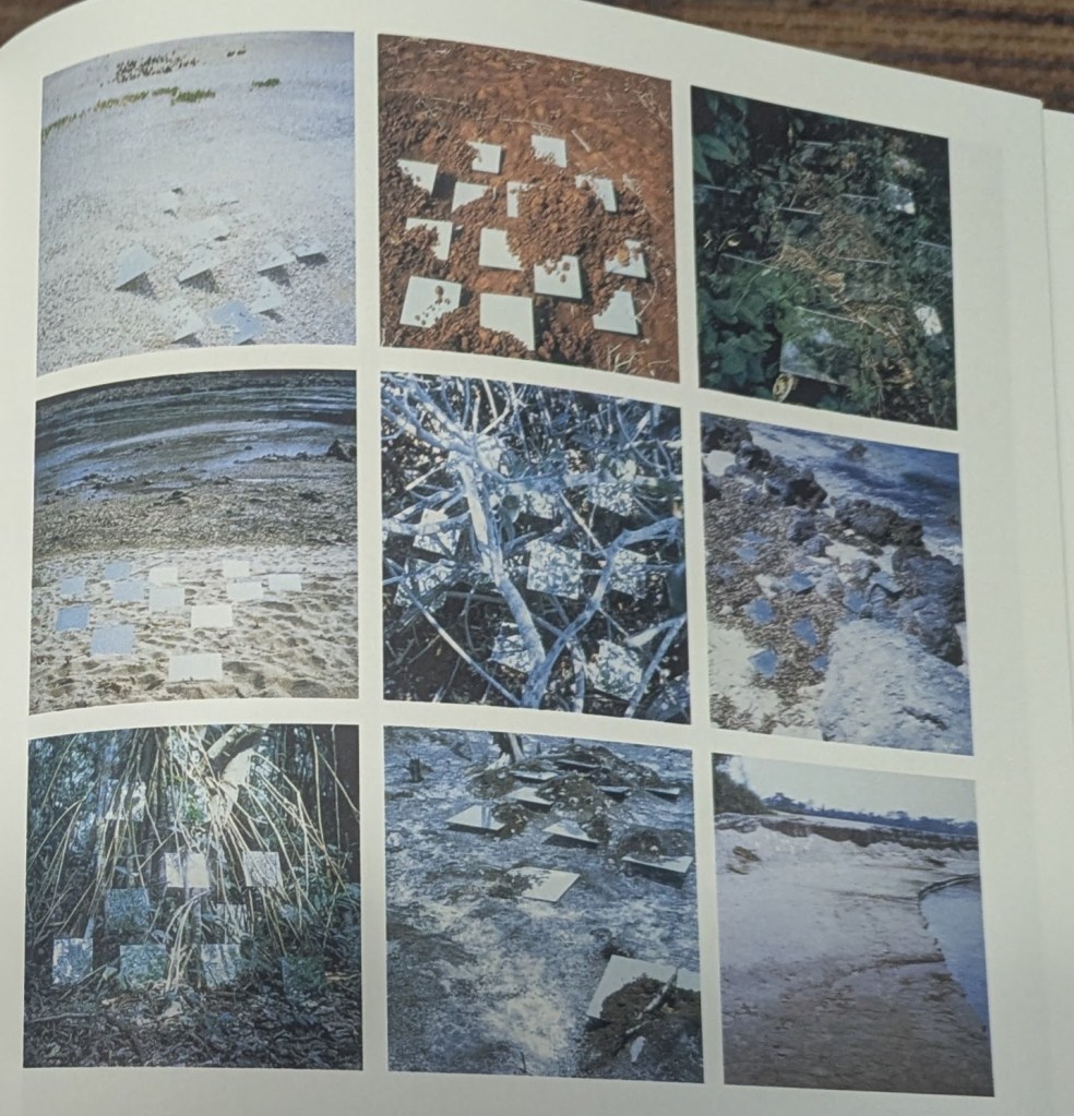
The same thing, different locations, different times. It makes you think about what those mirrors are seeing that we can’t.
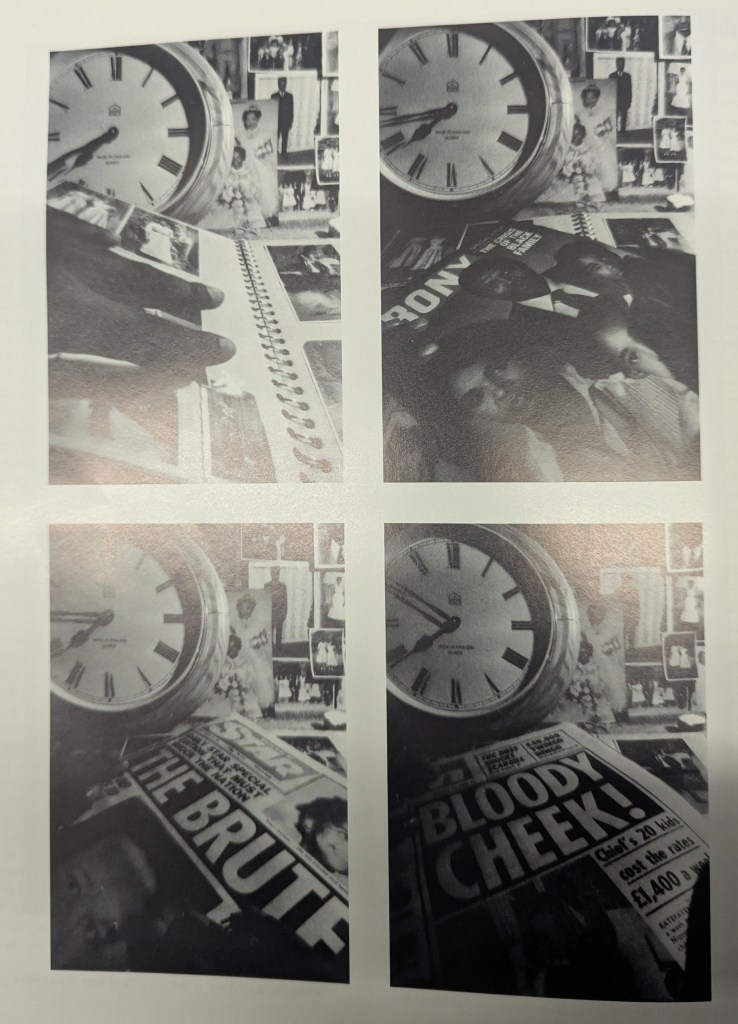
I then found a book by Peter Kennard. Containing no text at all, I had no idea what I was looking at. I mainly became fascinated with its structure and pairing of images. Looking it up later on, I really wish I’d found this book a month ago…
Being of a digital age, I assumed it was Photoshop. Reading later on, it’s goddamn Photomontage!
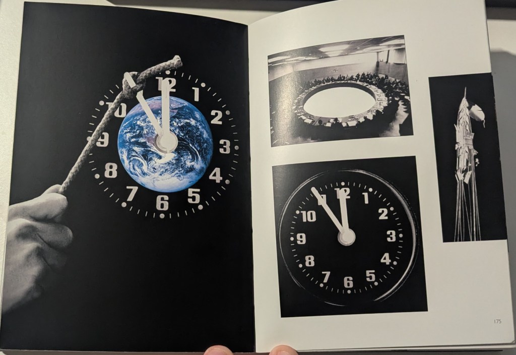
The images on their own are powerful but are even more so together. Even if it’s as simple as “They’re all a circle/clock” or something more. Whereas personally, I don’t understand the message fully and cannot connect with it, I can appreciate it being something wonderful.
Diptychs: A Detour
At this point in my research, I hit a blockade.
I was getting to a point where, I knew what was expected of me but not what I actually wanted to make.
I loved the idea of the Trading Card & Tablets, the Book and E-Book, but wasn’t sure where to take it from here. What more could I do?
It had to be two images, a Diptych. Let’s start with that.
Breaking my rule, I ended up finding a post from “Kate Back Drop” talking about diptychs and what you can do with them. She breaks down some themes and ideas to work with.
I’ve been looking at this too closely, focusing on the minor details against the bigger picture hehe. Let’s take a step back and see what we can find.
Building the Final Two Diptychs.
I knew I wanted to recreate a few images so spent sometime focusing on that. I had three ideas I wanted to work with but, while attempting to recreate them, the final two ideas showed themselves.
Trading Cards // Addiction
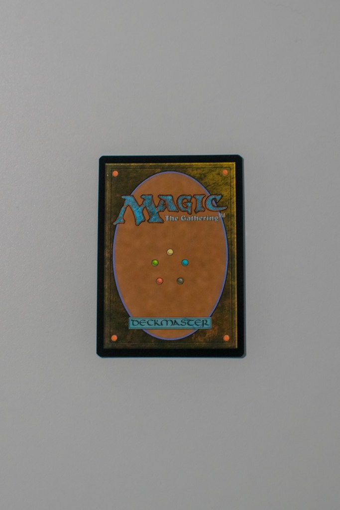
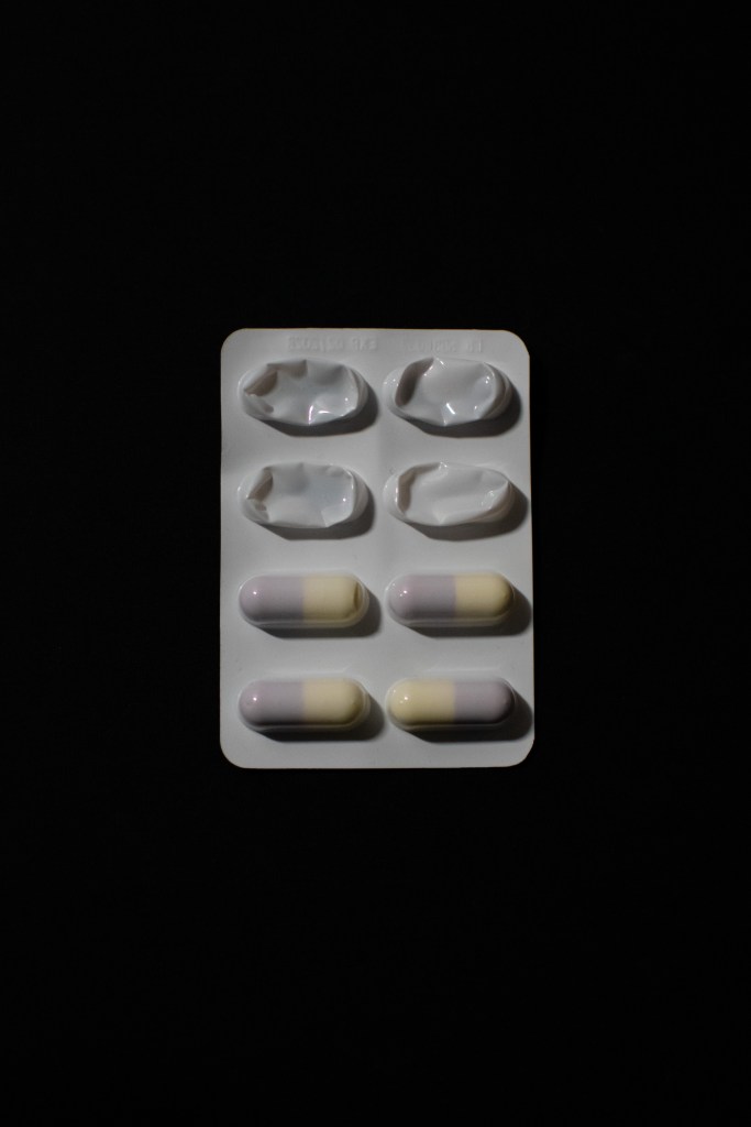
Albeit simple, once you think about it, it’s quite a statement. I’m so happy with how this came out, the clarity and colour or lack thereof. It feels very “Ying/Yang”. I asked people about the message, what they made it out to be and very few managed it. Those that did, mentioned that they played MTG or Pokémon themselves and quite often felt like it was akin to Gambling Addiction.
Safe Space
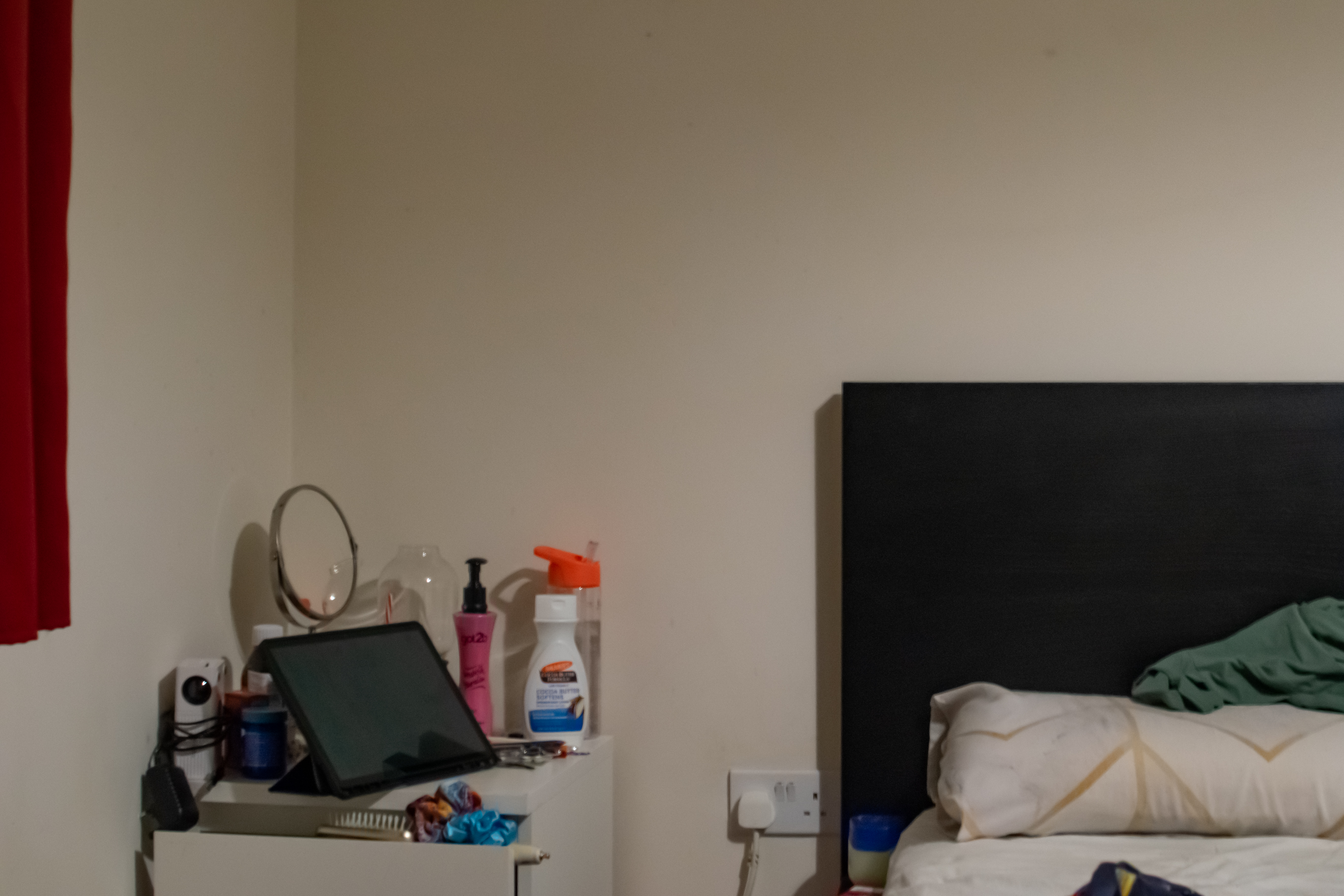
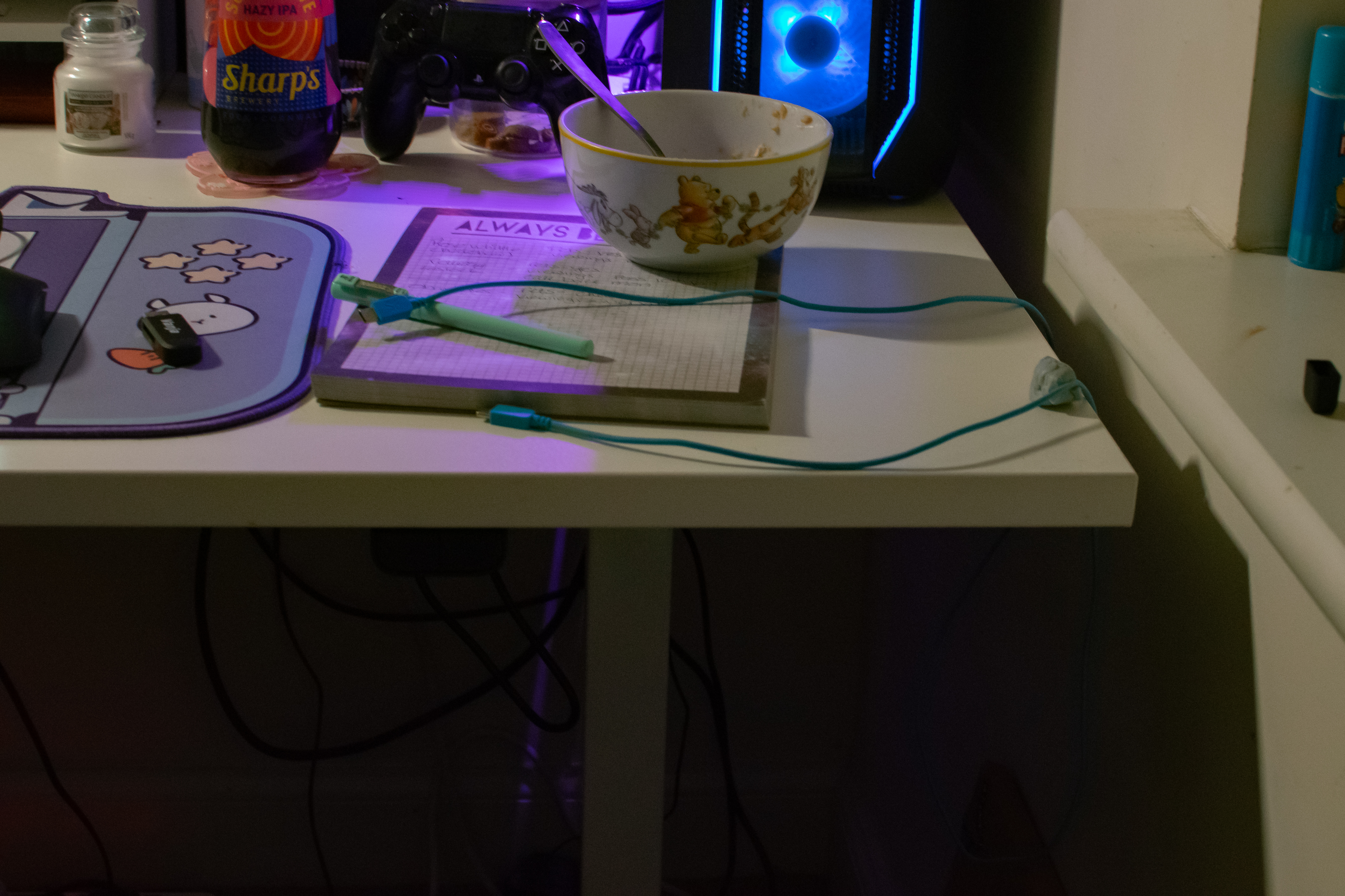
For most people, their safe place is at home. For me, it’s my bed and my desk. These are my spaces and I am safe here. This idea was tough to complete as I needed to shoot the right-hand side of my desk and there wasn’t enough room to get the distance I needed. I’m happy with it but know I could have done better.
Final Thoughts
I’ve always preferred collections over single pieces and this has solidified this opinion. It gives you the ability to show one story, have a conversation or even just show two sides of a situation. With multiple images, you’re telling one big statement and it can become too much.
I really enjoyed playing around with this concept and idea. It was great fun and let me play with shapes and concepts.

Leave a reply to Module Two: The Final Wrap Up – AlphaRose Photography Cancel reply